
ECCO
- My role
- Branding Consultant
- Period
- April 2023
In my first branding consultation after switching to marketing and e-commerce, ECCO had a good product, but the way it presented its contact lenses did not fit its audience. I focused on what shoppers would see in the store and on the box.
Compare the proposals
Concept 1Arc wordmark
Concept 2Star inside the O
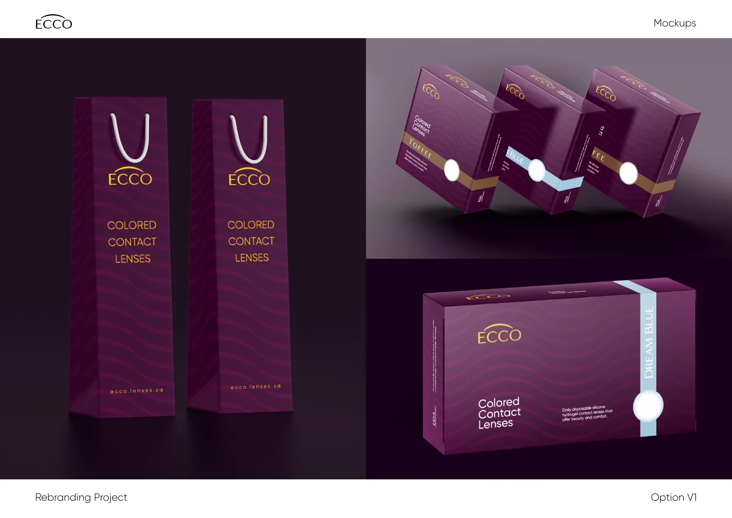
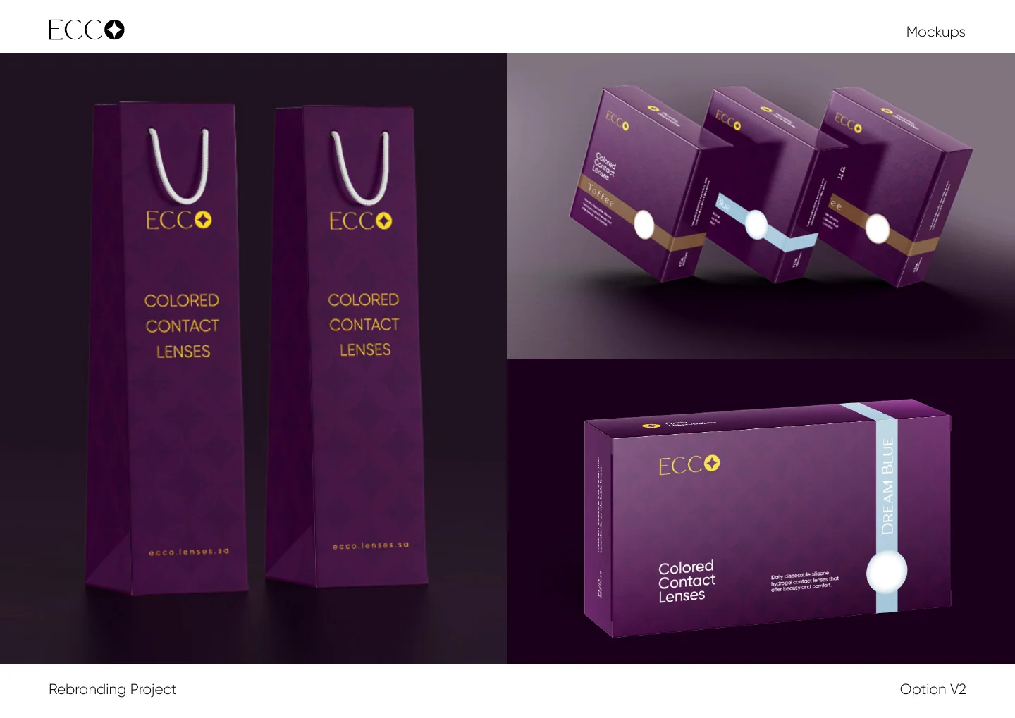
Move the divider to compare the two proposals
The two proposals use the same purple bags and boxes. Compare how each mark reads across the face of the box and the narrow panel of a carrier bag.
The work in detail
- The visual direction board brings together purple and gold, eye photography, the online store and printed applications.Stylescape · p. 1
- The first proposal places an arc above ECCO and keeps the full name in its small icons.First proposal · p. 4
- In the second proposal, the final O becomes a standalone symbol that also appears in the packaging system.Second proposal · p. 4
Project documents
Project documentsPDF
Read larger text
10.2 MiB · 1 pp
Choose document · 3
Browsing the complete project archive. Entry for ECCO · p.
Back to the proposal comparison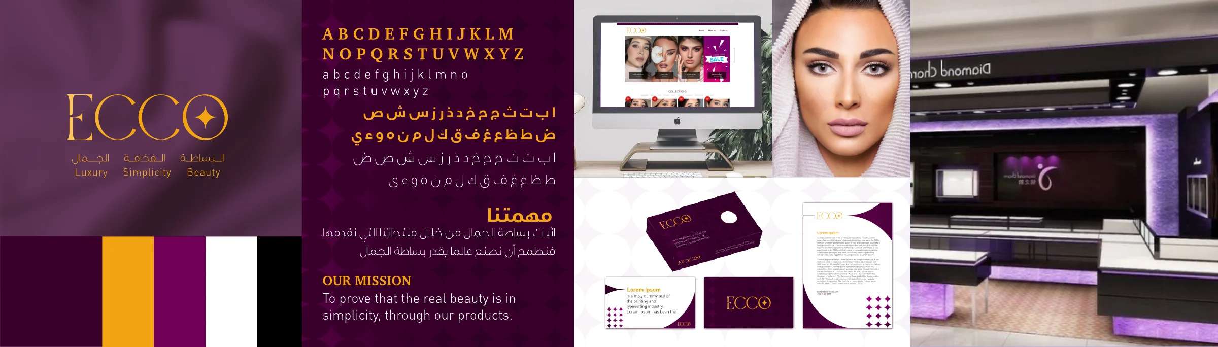
Opening the PDF…
Open the PDF in a separate tab